Getting the Best Print Quality for Your Photo Calendar
Whether you’re creating a personalised photo calendar for yourself or ordering in bulk, a little preparation goes a long way. Follow these simple artwork guidelines to make sure your calendar prints look exactly as you’d hope.
Start with Good Organisation
Before you begin building your calendar, gather all your chosen photos and store them in a dedicated folder on your desktop. You can then select them all at once and upload them directly to your library on our site, saving time and keeping things tidy.
A couple of quick tips:
- Stick to JPEGs — they’re the recommended file format for calendar printing.
- Keep images in a consistent ratio — this ensures a clean, uniform look across your calendar pages.
Why Your Photos Might Look Dark in Print
This is one of the most common photo calendar printing issues we see, and the good news is it’s easily avoided.
If your photos appear darker in the final print than they did on screen, it’s almost always down to screen brightness rather than print quality. Screens, especially laptops and Apple devices, are often set much brighter than the lighting conditions used in print production.
As a rule of thumb, turn your screen brightness down slightly before editing. On Apple devices, we find that just below the halfway point on the brightness slider tends to give a much more accurate preview.
Using Histograms as a Guide
For photographers who use histograms when shooting, they’re just as useful when reviewing images on screen.
If your histogram looks weighted toward the left but your image appears well-exposed, that’s a strong sign your monitor brightness is too high. Use this as your cue to dial it back before making any exposure or brightness edits.
Colour-Critical Work? Use Soft Proofing in Photoshop
For customers who need precise colour accuracy, particularly when ordering large print runs, we recommend soft proofing in Adobe Photoshop. Unfortunately, Lightroom doesn’t support CMYK, which is the colour space used by commercial printing machinery.
Here’s the process:
- Set your working colour space to sRGB
- Open your image in Photoshop
- Go to View → Proof Setup → Custom
- Select Coated FOGRA39 (ISO 12647)
- Configure the pop-up settings as shown in Fig. 1
This will give you the closest on-screen approximation to your final calendar print. Though keep in mind it does depend on your monitor calibration and brightness settings.
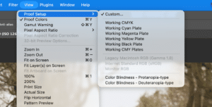
Go to View –> Proof Setup –> Custom | Johnsons Calendars
(Fig.1)
Consider a Printed Proof
If colour accuracy is particularly important to you, or you’re placing a large order, it’s worth requesting a printed proof before going to full production. It’s the most reliable way to see exactly how your calendar will look before it’s printed at scale.
Need Help?
Have questions about preparing your artwork? Don’t hesitate to get in touch, we’re always happy to help. Please contact us here, or email sales@johnsonscalendars.co.uk, or call 01270 235207.